As a practice for our real music front covers we were asked to do a preliminary exercise. I had to produce a front cover and contents page for a new school/collage magazine. The magazine front cover had to include a medium close up primary image of a student for a background and then have appropriate text and images lade out around it. Also it had to have a well named title. After that we then had to do a contents layout that consisted of images and writing to follow up the front cover.
 Preliminary Front cover analysis
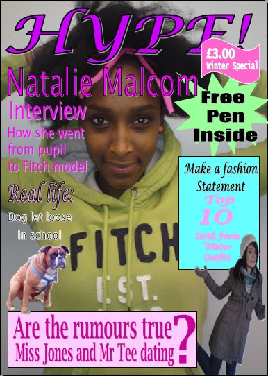
I decided to do my front cover in publisher. What I liked about my front cover was that it didn't have any spare gaps and everything stood out on it in order of importance. The title is very clear and stands out on the page well. I have done this because the title is the main identifying point of a magazine and it is what people will look for when picking it up off the shelf. I decided to name the magazine 'HYPE!' i called it this because its contents is based on the gossip and fashion of what is going on around the school's sixth form and so my idea was that the magazine would be the centre of the hype gossip and fashions every one is talking about. I also used the same make of font through out my front cover but different types of it to add variety. I tried to use a lot of winter colours in the text such as purples, blues and pinks in order to enhance the winter special theme. Behind some of the writing I put blocked colour text boxes in order to help separate the writing from the back ground picture and make it stand out. With some of the bits of writing i decided to add some primary pictures to go with the text and help entice the reader in. I made the pictures a lot smaller than the background picture so they didn't draw the attention away from the main story.
If I were to do my magazine front cover again I would change the background colour and lighting on the mid close up picture of Natalie. I would change the background colour to a light shade of pink in order to help the background fit in the general colour scheme. What I would do to the lighting is make it a lot brighter in order to enhance Natalie and make her stand out. Another thing I would change is the three pound winter special sign. I would probably make it a lot smaller in order to prevent pulling the attention away from the 'free pen inside' as that is a key feature in getting the reader to buy the magazine.
Over all i think that it was a good preliminary front cover as it had everything it needed to stick to the brief. Also it has helped me to really understand how using different fonts, colours, picture sizes and layouts can make a front cover look good and coordinated. Another thing that it has done is really helped me to get familiar with publisher which is most likely the program that i am going to use in my main task.
 Preliminary Contents Analysis
For my contents I had to produce a mock up that could demonstrate that I knew what a contents layout looks like as well as helping me to grasp how to use the program in order to create it correctly. To make my contents I used publisher, as I thought it would be an appropriate program to use. My contents consisted of page order bullet points saying what was going on in each page, pictures and page numbers. The first bullet point was the interview with Natalie. As it was the main story, I made it so that the text and the picture used was the biggest in order to make it stand out. Another thing I did was put a quote of what Natalie said in the interview next to picture in order to hook the reader straight away. How I layed out my contents page was that I put the articles in page order and then i grouped them into sections of what each particular article was related to. I think that this is a good idea because it makes the contents easy to use in order to find what page you want as well as making the magazine itself easier reading. An example of what i mean by this is that is if a reader only wants to know about the gossip of the school then they can look between pages 7 and 23 and all that they will be reading about is the gossip of sixth form. Another thing i did was make the 10 stand out in the 'top 10 winter sixth form outfits.' I did this because it was at the bottom of the page and i wanted it to stand out as it was a key article in the magazine.
If i was to do my contents for this magazine again what i would change about it is how i did the page numbers. Instead of making the text alternate black and white colours i would make it all white. The reason i would do this is because the the black page numbers blends in to well with the text and therefore they are not very noticeable in comparison with the page numbers in white. Another thing that i would do is change the '40' under the 'cross word challenge' to P40 in order to make it more evident that the 40 is a page number.
Over all i think that the layout of my contents works well, with the writing down the left hand side and the pictures down the right hand side. The layout is also very easy to understand and the pictures go appropriately with the text. Finally there is no gaps and the colour/font schemes follow the general theme of the magazine really well. This has been a good preliminary exercise and it is going to help me a lot in the main task when making my front cover and contents.
Main Task
Kerrang! magazine

Kerrang Magazine Front Cover
Kerrang is a magazine for people who like rock music. From the front cover you can tell that it very in your face and mainly aimed at a male audience. This is shown through the colour scheme being black, red and white. Also they are all males in the picture (band Biffy Clyro) and it has no decorative features around it. The facial expressions on the men are all very serious. I think that Kerrang have done this to back up the slogan "we are not doing things to please people."
The layout is kind of a messy style with pictures and text dotted about all over the picture and different angles. This messy effect kind of imitates the stereotypical view of boys so this layout can also help to put across that the magazine is aimed at a male audience. The title however is very bold and has nothing across it. It is spread over the top strip of the magazine and is white on a black background. This is obviously a very good identifying feature and it easily stands out on the magazine. To use a big bold title like this with nothing covering it could be very good to add in my magazine as it is a magazine that would help to make it identifiable over other magazines on a shelf. The lighting on the picture is very dull apart from at the faces where it is a lot brighter. By doing this they are tying the picture in with the dark theme of the front cover and also it makes the facial expressions stand out more. Like in NME magazine around the other pictures on the page it has a border to separate them from the main background picture. Also like in MixMag to highlight that there is something free inside they have put a spiky bubble around it and behind the bubble they have put a picture of the front cover of the CD that is free inside. In the other two magazines that i have analysed the code bar and price is based in the bottom right hand corner. This is probable something that i need to consider when designing my magazine. Unlike on the other two magazines Kerrang have a background colour behind all of the text. The main story is in the middle of the page like in NME magazine and the name of the band Biffy Clyro is the writing that stands out the most.
Overall i think that this magazine has a very messy layout in order to suit its target audience, and in order to make it stand out it uses bold colours and borders to separate it all up. it has its own identity and put across well who there target audience is in the front cover.
Kerrang Magazine Contents
Like in MixMag, Kerrang have used a whole page to layout their contents. Following the theme of the front cover their contents is layed out in a messy style with lots of different colours, font types and font sizes. The contents page is clearly split into two sections this is shown by the top half on a mainly black background and the bottom half on a white background. the bottom half is more about what is on each page and the page number and the top half is mainly picture based with a few numbers next to it.
the contents is set out like MixMag where it has grouped the articles and put them in page number order. to add to the contents to make it look a bit more interesting they have also put in pictures to further explain what is on the page. they have also clearly highlighted the different groups by putting them in a big, bold, yellow text with a black background. like in mix mag and NME once again the page number is a different colour to the to the text however they have put the page number before the text unlike the others where it is after. the main colour theme to this page is yellow, black, red and white which is the same as the front cover but with the addition of the colour yellow. for the pictures at the top of the page interestingly they have taken a scaled down image of what the page looks like and put a number next to it. i think that this is a very effective technique to use as it makes you want to turn straight to that page to read about it. another different technique that they have used is next to the stories that were on the front page they have put page cover story. i think that this works well because it highlights that that it is an interesting story that the magazine wants you to read with out having to waste space by using bigger fonts to highlight it. at the side they also have a little article by the editor saying what they have put in the magazine and why. this is quite a good technique to include because it shows why they are featuring particular articles in the magazine. the title of the contents is at the top of the page and in a thick bold yellow font. it has an issue number underneath it as well as the date of the magazine.
over all i think that the layout of this magazine contents is very good. it looks busy yet it puts across the information very clearly. also it looks a lot different to the classic layouts of contents.pages because it gives it a better identity. also it uses different techniques such as the stars highlighting the stories that are on the front cover. when i come to make my contents i think that it would be good to add in a technique that hasn't been used before to further give my magazine a new state of identity.
Kerrang Double Page Spead Analysis
This is a double page spread from a music magazine called Kerrang. Kerrang's target audience is teenagers that like rock. The main font type that they have used throughout this page is Arial. I think that they have done this to make it easy reading for the reader. They have used an extra large capital letter at the start of the passage of writing. This is a good idea because it highlights the start of the passage of writing to reader and there for making it easier to understand. They have also used this big capital letter idea again in the page (big I) at start of a new paragraph. It is a lot smaller than the one they used at the start of the page (big L) but i think that this is to state that it is a significant new paragraph talking about a different topic but it is not as important as the main topic. It is like they are trying to put in a sub heading but they are using a letter to show it. On the top right hand picture there is writing across it. The writing is a quote from the main text that Simon Neil has said. The writing they have used to do this quote is a lot bigger than the other writing on the page. I think that Kerrang have picked this passage out of the article because it sums up the band and is quite an eye catcher. (quote: we were never interested in doing things just to please people 'SIMON NIEL') a lot of the magazines that i have looked at seem to have this as a way of attracting the reader into reading that page. I think that it is a good idea and i will most likely use this on my double page spread. The colour of all the writing on the page is black and i think that they have done this so that the page doesn't look to busy and it also keeps a lot of the attention on the pictures. They have used a khaki green colour behind the writing over the picture. This is a good thing to do because it separates the writing from the pictures behind it so it doesn't get lost in it.
on this page they have used a range of pictures of the band members having a laugh at the sea side. it is a windy day and from what they are wearing you can tell that it is very cold but from there facial expressions you can see that they are having a good time. the setting of wherre they have taking these picture real helps to emphasise how the band feels on life. also it back up well what they are talking about in the text. when i come to take my pictures for my double page spread i will need to think about the setting in relation to the contents. they have used a range of pictures such as mid close ups one band member and then a mid shot on a two of the band members and then freeze shots on the band having fun.
over all i think that this is a good double page spread with an easy lay out to understand and has specific features on it in order get you interested to read the article.
MixMag Magazine
 Mixmag Magazine Front cover
Mixmag is a magazine for people who like dance music and clubbing. From the front cover you can tell that it is very new and funky which could suggest that it is aimed at a young target audience. There is a young lady on the front cover and a lot of the writing is a barbie pink colour which could also suggest that the magazine is aimed at women. The title is big and bold at the top of the page. By doing this it helps to make the magazine identifiable along side a load of other magazines on a shelf.
They have chosen to use a long shot picture of a lady as their main background picture. She is wearing a very bright coloured, short, fashionable dress and holding a chihuahua with gem headphones round her neck. her hair cut is very recent and she is standing in a very posy position. This image demonstrates a message of the magazine being young, stylish and out there. They have put this image on a very white background, i think that they have done this to make the lady stand out from the rest of the page. The bright colours of the dress also go very well with the bright pink writing and together on a white background it makes the magazine stand out a lot. this is good because by using very bright colours it is drawing a potential buyers eye away from the other magazines on the shelf and onto the Mixmag magazine. The main story is on why celebrity DJ's must be stopped and so the picture is their to back up the main story. they have put across the image of DJ's by making the women wear headphones and also she is standing in front of a set of DJ decks. The facial expression on the women is kind of a shocked face and this showing her reaction towards the main story.
The layout of this front cover is very typical and what i have found on most magazines that i have looked at. it has the title at the top (Mixmag) in big bold letters that are the biggest on the page and are stretching across most of the top. This is followed by the main story just underneath set out in lots of different fonts and sizes but mainly the second biggest sized writing on the page. underneath that you have got what Mix mag considers to be the other main stories dotted on the right and left hand side of the page, around the main picture that is in the middle. they ave put the date and how much it costs in the bottom right hand corner and the writing is very small denoting that it is not of that much significance. A very unusual bit to this front cover is that it has mentioned that they are giving something away twice. once at the top and once in the middle. i think that they have done this because they feel that the free CD is a very important feature of a magazine and if it is at the bottom of the page then by the way magazines are stacked behind one another on the shelves it would be missed. this is something that i need to think about when i am designing my magazine to put the features at the top as that is where they are most likely to be seen.
There is only two font colours on the front which are pink and black. they seem to have focused more on using different font types and sizes in order to separate the writing and put it in order of importance. the two colours that they have use (pink and black) are mainly alternated through out the page. i think that it is a good idea to only use two colours because it doesn't make the page look as busy and it focuses the attention more on the picture.
Other effects and writing that they have used on the page is that they have put a border and a bubble around two of the bits of text. In each of these bits of text they are saying that they are giving away something. this is a good idea because it highlights it to the reader and it also works as an establishing bit of text meaning that if the text has something around it, it is being given away.
overall this front cover has a very good layout and has used font sizes and colours very effectively. There is know gaps and the page looks very well blended. MixMag Magazine Contents
the contents to this magazine was not on the first page, it was on the third page behind some adverts. this could suggest that for this magazine the front cover does all the explaining and the contents is only there to help.
the contents page has a picture of the women with the chihuahua and the decks but in a different position to the picture on the front cover. at the top of the page it has 'contents' in white capital letters on the right hand side and then next to it on the left it has the issue date and the title MixMag in a smaller font. the background this time is black and all of the writing on it is white and yellow. the page numbers are in yellow and the rest is in white. the page numbers and there content are set out in order and then put under sub heading. this is quite a common style to use in a magazine because it makes it easy to use as then read the section of the magazine that they are interested in with out having to flick about all over the place. the number is bigger for the main story section and it has a picture with it. however the picture isn't the biggest on the page and the number is only a little bit bigger than the rest. i think that they have done it like this because they don't need to majorly emphasise the main story again as they did it on the front cover and the reader is already interested however i think that they have made the page number a bit bigger than the rest to high light to the reader that that is where they need to go to find it. i think that this is a good idea and i need to take it into account when designing my contents. on the contents the main bit that stands out is a huge photoshopped picture of a crowd with their hands up and confetti coming down over them. on the picture is a big page number with a little bit of normal sized bold writing underneath. this picture takes up a third of the page and is there to really highlight one of the articles that is also mentioned at the right hand side of the page. This is done a lot through out the magazines and i think that it would be a good technique to use when designing my magazine. at the bottom of the page is a section tellin gyou about the free CD that you get and stating the tracks that are in it. it has a mini picture of the CD's front cover with summery of what it is about on the left hand side and the tracks it consists of on the write hand side. this is obviously a section that is very important to the magazine as it is niot part of the contents but they have put it on the first page as part of the contents. so that the section doesnt look part of the contents they have seperated it of by putting a line between the contents and the infomation as well a line undernieth.
over all i think that this contents has been layed out very well and is very easy to understand. it has pictures and highlighs the key features of the magazine well and where you can find them. MixMag Magazine Double Page Spread Analysis
this is a double page spread from a magazine called MixMag. this particular story is the main story of the magazine and it is spread over 5 pages. this double page spread is the first 2 pages of the 5. as you look at this page the bit on it that stands out the most to me is the title 'welcome to Lame Acadamy. the reason that this stands out is because it is by far the biggest writing on the page taking up a whole half A4 side. Behind the text is a really yellow backing. i think that this the key to why it stands out so much because the yellow doesnt fit in with the general themed colours of the page. i think that this yellow blodge has been used very cleaverly on the page because it kind of works as a double meening. it high lights the title and it is also is acting as a sun. this is shown because the yellow blodge is situated in the top right hand corner and is in a shape of a classic interpratation of how a child draws a sun. also the lighting on the picture is coming all from the top right hand side as if the sun is creating it. i think that they have added in the sun in this way because it puts emphasis on the theme in picture of the celebrity going on holiday. (shown by the lady wearing sun glases and pulling a suit case). the whole of this page seems to be baised on the classic celebrity image. i can tell this because the picture is of a very glammed up girl holding her equally as glammed up pedagree dog and having all the paparatsy interested in her and wanting to take pictures. i think that this has all been done to support the play on words in the title and the text underneith it. 'the lame acadamy' is an abriviation of 'the fame academy' hense the woman looks all glammed up in the picture- 'fame'. 'lame' means not very good and by putting it in the title in this way it shows a very child like way of thinking so it is moking the steriotypical celebraty image. when i come to design my double page spread i will need to think of clever techniques such as this to make it stand out and look different. also it will help me to merge the picture with the text. undernieth the title they have wrote an abriviation of what the article is about in the style of questions. this is also another good technique i nedd to think about using because it can help the reader straight away to deside whether the article interests them and also it can pull the reader in to wanting to know the answer to the questions.
the layout has one picture taking over the whole of the double page spread, with the title in the top right hand corner. undernieth the title is a abriviation of what the article is about and in the bottom right hand corner is the start of the article. like in Kerrang MixMag has used an oversized first letter to highlight that it is the start of the article.
overall i think that this is a very good double page spread and it merges the picture, title and content really well together. it uses some very good techniques that i will need to think about using when i come to make my own double page spread.
NME Magazine
 NME Magazine front cover
NME magazine is for people who like rock music. from the front cover you can seee that it is very bold magazine aimed at both genders from high teens upwards. this is shown by how they have used bold red writing over a picture of a pretty well made up women. By a colour theme of black, red and white they are using colours that are more related to boys and there for more apealing to boys and then mixing the red with the female in the picture they are bringing a more sexier side to the magazine and there for making it appealing to women. rock is a very statmenty genre of music and this mnagazines shows of that it is for people interested in rock by using statement bold writing and having a women on the front with a statment hair colour. they have used the colour of the hair very well in this picture because as well as putting across a statement message it is also blending in with the colour sceme of the front cover. Blending the picture with the writing seems to be a technique used alot when designing a magazine and i think that it works well in order to make the front cover look organised.
The font used through out this front cover is mainly a bold capital letter font that has a slight shadow. i think that they have chose this to make the storys look more apealing and to make them stand out more from the other stories on the shelf.
The layout of the frontcover has the main story at the top above the title unlike in MixMag where the main story was under the title. Also the title is very hidden behind the picture unlike in MixMag where it was and hardly covered at all. NME could have layed it out like this because they might think of them selfs as a well known magazine with dedicated readers and so there for the title is not the most important part on the page. when i come to design my front cover i am going to make sure that my title is hardly covered and bold because we are designing a new music msagazine so no one would have heard of it so i want to make it as reconisable as possible. the main story of this magazine ('florence takes amarica') is set out a bit differently to MixMag, the writing takes over most of the page, covering alot of the picture. the writng is also an alot bigger size than the one on mixmag and in the middle of the page. on the right hand side of the page it has an aditional picture with a white fraim around it and a quote undernieth from the guy in the picture. By taking key quotes and putting them on the front cover it is a more interesting way of saying that the artical is an interview with out actually having to mention the word initerview. i like this technique as it is a more interesting way of using the space on the page. the price of the magazine is mentioned twice on the front cover once under the title and the second in the code bar which they have placein the bottom right hand corner the same as mix mag. unlike mixmag where it has 11 stories on the front page NME only has 3 and they sre all bigger and bolder and more pronounced. however at the bottom of the page like MixMag they have summed up in one for each story what else is in the magazine. finally like mix mag in the top left hand corner it has some diagonal writing in a block stating something that you can find in the magazine. this might be a good technique to use when i come to design my magazine. NME Magazine Contents
the contents page to this magazine is set out alot differently to Mixmag. it has a thin collum going all the way down the left hand side saying what is on each page with the page number next to it. the writing is very small and all the same colour size and font. what is on each page is in red and the number is next to it in black all the same size. it is good that the number is in a different colour because it seperates it from the text and makes it alot clearer. It is not in page order and there is know sub headings to sectionise the content, instead they have put it into cronilogical order of what artist is on which page. the advantage to this is that if you know that you want to read up about a certain artist then you can find the letter and go straight to that oage however a disadvantage to this way of laying out the content is that if you were looking for a certain topic or type of article e.g. an interview then you would have to flick through the whole of the magazine to find it. The title at the top is in capital letters following the theme of the front cover but it is not named content it is called 'what is inside.' by setting out the content like this it is kind of saying to the reader that it is there because it has to be there and helps but they would rather leave it out and use the page space for something else. also on the page is an article and a advert at the bottom. the content is seperated from the article by two dotted lines running down either side of the content.
over all the content is very minimalistic and quite hard to understand. i dont think i will be designing my content like this at all as it is alot easier for a reader to understand a content with pictures, order and different fonts and sizes to show the significants of each article in relation to the magazine. NME Magazine Double Page Spread Analysis
this is a double page spread from a magazzine called NME. like in Kerrang and MixMag this is also the first double page spead of the main story on the front cover of the magazine. this article is about how the womon in the picture (Florence Welsh) has conquered the USA with her new song 'you've got the love' but she is very angree with her self. like in mixmag they have only used one picture that is spread over both pages as an interpritation of the article. The picture is of a women sitting on what looks to be a US flag layed over some stacked up boxes. i think that the message that they are tring to imitate with this is the conquuring part of the USA. the stacked up boxes act as a podium and the US flag over it astablishes that it is the USA. she is dressed wearing all black- to wear black is kind of a gothic look and the steriotypical view of goths is that they like to berry thier feelings inside them. this could be them trying to imitate her feeling through what she is wearing. also her hair is all over her face and her expresion is very dull this also helps to show the reader that she is hiding her hair and is quite unconfortable. in the back ground behind her it has a big 'USA' and then infront of it over the A it has, 'got the love.' i think that this picture works very well with the picture and the article. once again like in MixMag they have used play on words to create the name of the title. as Florence's new song is called 'you've got the love' and the article is saying how she conquured the USA with it by putting them together it cleverly creates the title USA got the love. the picture has been cleverly taken so that there is a gap in it with a white background designed forn the text to be added over. this is a very good technique as it helps to blend the writing with the opicvture but by having black text on a white background it also helps to make it stand out.
The layout of this double page spreasd is very simurlar to MixMag it has the title in the top right hand corner and the start of the article in the bottom right hand corner. also it has a brief summery of what the article is about under the title and like in Mix Mag they have wrote it like a question. finally they have used a big D to state the start of the article. this was also done in Mix Mag and NME. in the bottom right hand corner it also has the page number, date and the NME logo. to put the logo and the number in my magazine on each page could be a good idea because then it get people familiar with it helping to boosdt the identity of the magazine. the writing has been layed out in colums and is the smallest text on the page. the font used for the main text is very easy to read and simple. this is a good idea because it then doesnt draw the attention away from the picture and also it makes it easy reading for the reader. i need to be carful that i dont use a to confusing font for my article because it might put the reader of reading it.
over all i think that this double page spread is alot like how MixMag layed thiers out down to the pictures and the text. i like the way they have used a double meening on the title and tried to mix the picture and the text together by deliberatly leaving a gap in the picture for the text.
No comments:
Post a Comment